Destiny 2 UX at Bungie.
Researching and redesigning HUD buff/debuff modifier system, leading UX for the new No Hesitation Auto Rifle, designing UX to communicate Power Enabled and Disabled activities, as well as communicating Fireteam Power to our players.
● I led UX efforts on many different aspects of Destiny 2, most of these changes can be found in the Final Shape DLC released on June 4th, 2024.
○ Besides the work listed above, I did a complete redesign and expansion of The Vault, including the addition of filtering and access from many screens within the game, although the only change in-game thus far is the ability to access The Vault from Orbit.
○ I also contributed UX work to simplifying Power in Destiny 2.
● I introduced and mentored "scrappy UX research" to our UX team, leading all stakeholder interviews, brainstorming workshops, discovery research, as well as usability testing regarding updates to the HUD.
● My responsibilities covered discovery research, stakeholder interviews, user interviews, data synthesis, workshop facilitation, UX design, comps, wires, prototypes, and UX documentation.
HUD Modifiers
For a very long time, there has been a request from our players to be able to get better feedback on all the actions and events that happen in-game. Before my changes, it was limited to four lines on the left section of the HUD.
● I led UX and UXR to learn, ideate, communicate, and collaborate with all the different teams and stakeholders that had a stake in the sacred ground we know as the HUD.
○ Conversations with team members and stakeholder interviews helped me understand our perception of the HUD's current state, and the needs and priorities of every team that would be affected by changes in the HUD.
○ With that in mind I moderated multiple workshops to get the Rewards Team to iterate on many different approaches to address those concerns and ideate on ways to think about HUD modifiers. We also decided on the three personas to use for our user interviews.
○ I took those ideas, and came up with different designs that mixed and matched different solutions we came up with during those workshops. I collaborated with other designers to design scenarios to prototype and use during user interviews. I built variants in Figma including all icons, states, and modifier types to cover those scenarios, and used those to build Figma prototypes.
○ I wrote up user interview discussion guides then collaborated with the UXR to fine-tune those discussion guides, and made any tweaks to our scenarios making sure we asked the right questions to gather the information we were looking for.
○ I led all of our user interviews, moderated all the conversations we had while two other team members were designated note-takers. I moderated all data synthesis sessions after each user interview to map out what we learned.
○ I worked on maintaining and expanding our Figma design system.
○ What you see in-game now is the final designs, minus one section that was left out due to a couple of reasons. On the UX side of things, we learned during our sessions that having modifiers come up on all four sides of the HUD was a huge cognitive load. And then there was the challenge of what we could fit on the HUD, and on the right side there was just not much space available for any more content.
No Hesitation Auto Rifle
I was brought in after most of this autorifle design and gameplay was already done. My responsibility was to lead UX efforts and make decisions on the best way to communicate to our players what they needed to know while using this weapon. I collaborated with everyone involved with designing this weapon, then worked with other UX designers and artists to put together old and new UI elements to effectively communicate when another player needed healing, if your weapon had enough charge to heal, and when other players were fully healed and you could go back to being a destructive badass Guardian.
The Glaive charge meter was added to the auto rifle. Teammates now had inobtrusive health bars to let you know their health state. You get notified at the bottom left of the HUD if you healed another player, or were healed by one of your teammates. The gun sight has a very distinctive heart which EVERYone loved (not my idea!) and visual and sound effects were catered to be distinctive elements special to this weapon. All of this together makes No Hesitation an amazingly fun weapon to use!
Power Enabled and Disabled UX
I worked on the UX to inform when events were either Power Enabled, or Power Disabled, and how that would affect their gameplay.
Figma Design System Upkeep
A good example of the work I did as part of the overall design system upkeep would be the Uber Tooltip component I built. I did a heuristic on every tooltip found in-game, and built a component that would allow any designer to apply any tooltip to any Figma designs. If you know Destiny 2, you know just how many different variations of tooltips can be found around the game. I constantly collaborated with all UX designers to make sure I had all their needs covered with this Figma component.
Example of Work at Kyndryl.
Improving a shifting design library while learning a new, complex industry. Building a culture of user-centered design, and strong collaboration between different disciplines.
● I was the Lead User Experience Designer responsible for all designs that are part of Multi-Cloud Management Platform - Service Provider edition. That includes my own designs, as well as synchronizing and overseeing any Service Design work done by any other UX Designers at Kyndryl.
● Our target audience was larger companies that needed to manage their own multi-cloud tenants and customers.
● The challenge here was in three parts.
○ Discovery research and user interviews were not available to us. I led the effort with our UX Researcher to work through that challenge and make research a necessary part of all stages of design.
○ The design system was temporary, we rebuit it to align with Kyndryl, as well as fix accessibility issues. I led this effort in collaboration with our UX Researcher.
○ The workflow was mostly siloed, with an extreme lack of communication across disciplines. I worked within the organization to build a culture of constant communication and collaboration between UX, Product and Dev.
● My responsibilities covered discovery research, stakeholder interviews, user interviews, data synthesis, workshop facilitation, UX design, comps, wires, prototypes, and accessibility evangelizing. I also worked to mentor UX Designers, managed multiple designers working within Service Provider, and lead the effort to update and move our design system from Sketch to Figma.
Examples of Work at Ascension.
Improving a shifting design library while learning a new complex industry.
● I was the Sr. Product Designer responsible for multiple products including an app for scheduling surgeries called Case Tracker.
● Our target audience was nurses and staff in doctor's offices and hospitals under the Ascension umbrella.
● The challenge here was in three parts.
○ I had much to learn regarding the health-care industry, and my designs would directly affect those who cared for and saved lives on a daily basis. My work would have significant consequences, good or bad.
○ The design system in use was more of a minimal design library. It lacked any responsive design elements whatsoever and was not accessible. I was influencing upwards regarding best practices on both fronts. (Later a dedicated Sr UX designer was hired to rebuild the entire design library from scratch, and was doing an amazing job at it while I was at Ascension.)
○ As with everyone else during the past 2 years, the pandemic was a challenge in regards to maintaining all the great in-person collaboration we had, virtually. This included research efforts, workshops, usability, etc...
● My responsibilities covered discovery research, stakeholder interviews, user interviews, data synthesis, workshop facilitation, UX design, comps, wires, prototypes, and accessibility evangelizing whenever it was beneficial.
Learning the problem.
Observing users in doctor's offices and hospitals, as well as multiple user interviews helped us understand their points of view regarding their environments, current workflows and problem areas.
User Interviews
Before the pandemic, I would visit doctor's offices and hospitals within the Ascension family. Some of the nurses and staff I observed in their work environment, and interviewed, were familiar with Case Tracker. I shadowed them in their work environment, observing everything they did, and asking why things were done a certain way, in order to understand their workflow, problems and workarounds.
After the pandemic, all user interviews and data synthesis were done virtually. Discovery research, feedback on designs in progress, and feedback on the alpha version of Case Tracker we're regularly done every 2 to 3 sprints.
● In all cases, our clinical informaticists, product team, stakeholders, and development team participated in various user interviews and data synthesis. This led to buy-in from all those who participated, and an understanding of why and how designs changed over different iterations.
● When designing new workflows in Case Tracker, I led multiple workshops with a diverse team from within Ascension. These included a surgeon, product lead, development lead, business analyst, and clinical informaticists to develop a service blueprint. This was used to build a discussion guide to use for user interviews to inform discovery research before beginning designs. I led all of these workshops and most of these user interviews, with clinical infomaticists stepping in when needed.
● I moderated our user interviews and facilitated data synthesis sessions with the rest of the team.
Creating Reusable Templates
During our discovery research, one of the pain points we learned was that adding procedures to a surgery was one of the most repetitive aspects of scheduling a surgery. Doctors had a very specific and repeatable setup for the different procedures they had. I designed an intuitive way to create, edit, reuse and manage procedures that can easily be used and tweaked when desired.
I facilitated a workshop for our internal multidisciplinary team to map out an initial workflow for R1 Authorization. I then led user interviews to validate (or invalidate) our team's initial mapping. After synthesizing the user data, I applied our learning to swim lanes matching the mapped-out workflow to contextualize what gaps could be addressed in my initial designs.
R1 Authorization
R1 authorization was required to make sure all surgery information and associated insurance were good to go before the actual surgery took place. Nurses and staff in some cases completed this process less than 24 hours before surgery took place. If anything needed to be corrected, Neither doctor's offices nor hospitals could make adjustments to the scheduled surgery unilaterally.
● Initial designs based on user interviews fell short. Development initially said no time could be made for any automation of the necessary communication between the hospital and doctor's offices.
● After a few failed iterations, I facilitated a workshop to help us understand why these designs failed, and what could be done about it.
● During the workshop it was brought up - what if dev actually had the bandwidth to automate the necessary communication between hospitals and doctor's offices?
● This led to a final design that tested well with our users.
The urgency of the pandemic was the drive for designing and developing Screen & Go. Ascension employees would self-screen every morning before they entered the workplace. This turned into an opportunity to offer the same capabilities to external customers.
● I was the Sr. Product Designer responsible for the fast-paced design of Screen & Go. Research and usability testing was nonexistent, but the extreme collaboration with our amazing product manager and developer made frequent deliverable iterations a very fun experience.
● Our initial target audience was Ascension employees. This grew to include large department stores, school districts, and events like the PGA tour.
● The challenge was the lack of time for research and usability testing. I had to do the best I could under the constraints of our design system (especially needing to work within allowed colors) and non-negotiable customer requests. Needless to say, compromises were made.
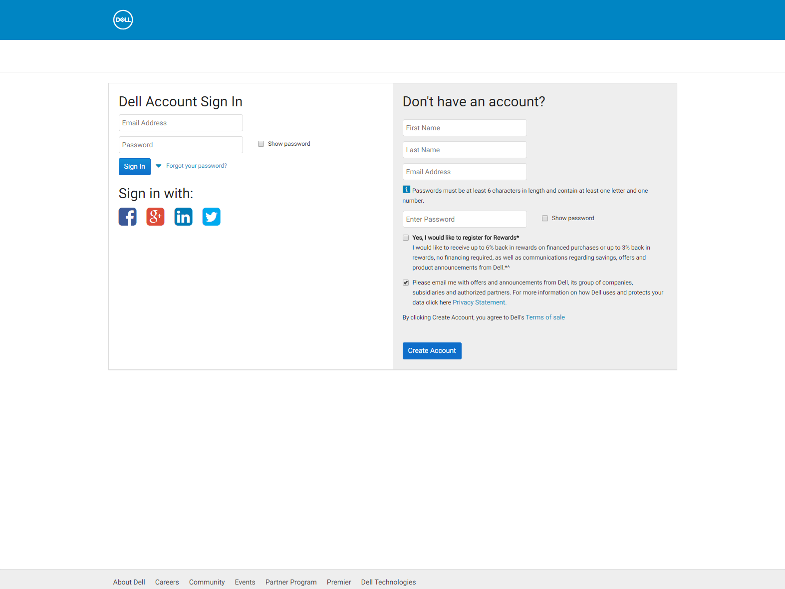
Examples of Work at Dell.
Working agile and lean, in a waterfall environment.
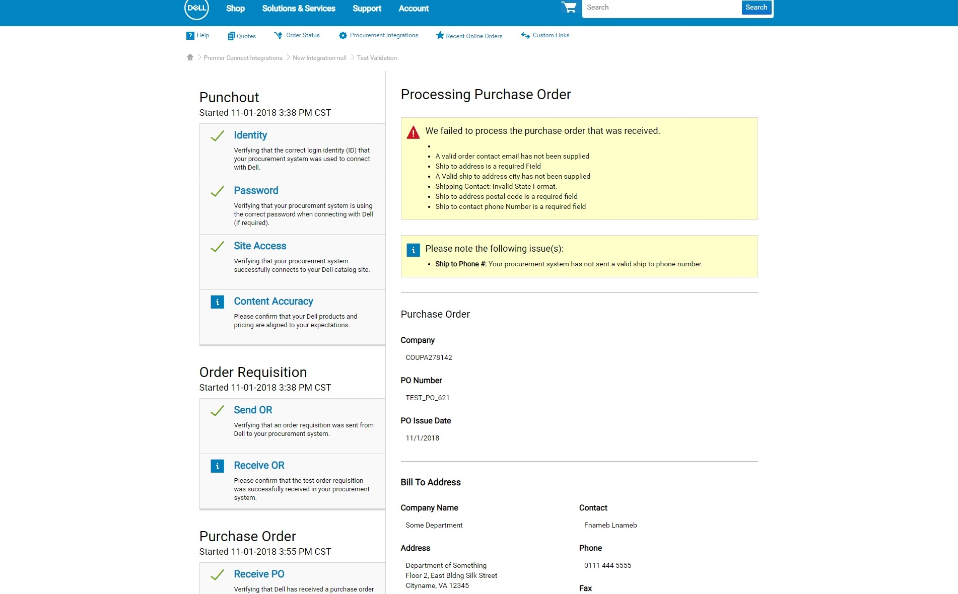
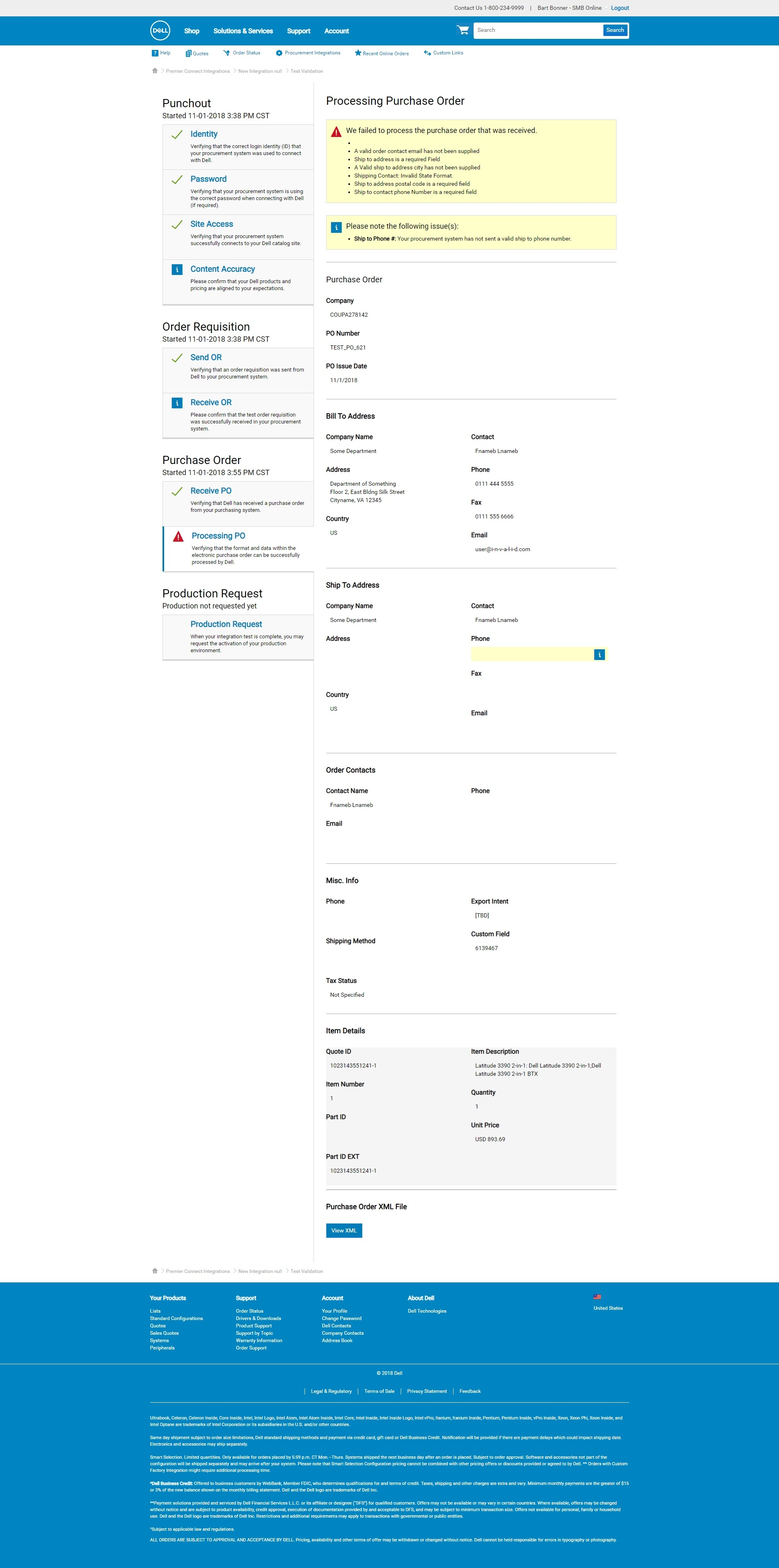
● I was the Sr. Product Designer responsible for the Testing Validation aspect of the ERP (Enterprise Resource Planning) Self Onboarding product.
● Our target audience was both internal Dell stakeholders and Dell GIA's (Global Integration Architects), as well as Dell's largest customers that use ERP systems to purchase Dell products.
● The challenge here was in 2 parts.
○ First, this was a new product that exceeded the functionality of even our largest competitors.
○ Second, our team was working in an agile and lean method, while still collaborating and synchronizing with a second waterfall team, on what is essentially two parts of a single product.
● My responsibilities covered research, stakeholder interviews, user interviews, workshop facilitation, UX design, comps, wires, prototypes, as well as general housekeeping and owning all miscellaneous issues and escalations.
Learning the problem.
Stakeholder interviews helped us understand their points of view regarding the current state and problem areas.
"GIA's can't rely on the testing process to predict success in production"
User Interviews
Based on the interviews we conducted, we discovered that our largest pain point was the excessive, and inefficient time it took to test and troubleshoot integrations before they were allowed to go live.
● Our customers are Dell's largest, and for the majority of our time working on this project, we weren't allowed to speak to them or show them our designs before actual production.
● My workaround for the lack of access to our customers was to "cold call" people on LinkedIn, managers from Pivotal, and technicians from companies that made the software used for our customers' ERP integrations. I found people with similar responsibilities to our users, and conducted user interviews with them. This gave us data to base our designs on.
● I moderated our user interviews, and facilitated data synthesis sessions with the rest of the team.
Facilitate Workshops and Discussions
It was my responsibility to encourage, include and to drive discussions within our team, as well as within the larger collaboration between the two teams working on this product.
Product owners, product managers and developers worked through sorting, assumptions and even sketched out initial ideas on how to think through different solutions for our designs.
Sketches
My responsibility at this stage was to encourage and guide our discussion - the rest of the team came up with these sketches. We then voted on the designs, or parts of the design, we felt was the best approach to use. I then took these ideas and conducted comparative research, and based my designs on a combination of all of these bits and pieces of information.
Wireframes - Experiments
At the beginning of my design process I created wireframes for testing purposes.
● Rather than design the whole product, I repeatedly ran small user interviews on small aspects of the design.
● Static comps were made, and we got quick validation, or invalidation, of these ideas early, and changed our design strategy accordingly.
● We used UserTesting.com to run these interviews.
More Complexity - Higher Fidelity
As we iterated, our product became more complex and I increased the fidelity of the designs. I collaborated with the developers making sure our work was in sync.
Iterative UI Design and Prototypes
For the second stage of our work - our Testing Validation History interface - I made my designs using high-fidelity prototypes in Webflow. We went through nine iterations.
● As there were no special components needed for this, prototyping was actually a faster way to build and iterate as opposed to static comps in Figma or Photoshop.
● Quick iteration and quick user interviews helped us learn and get to the most optimal solution in a short amount of time.
50%
LESS time spent per integration for GIA's.
20%
MORE leads due to increased efficiency of GIA's time.
3 minutes
Record time for self-service integration as opposed to the 6 to 8 weeks average prior.
50%
LESS time spent per integration for GIA's.
20%
MORE leads due to increased efficiency of GIA's time.
3 minutes
Record time for self-service integration as opposed to the 6 to 8 weeks average prior.
50%
LESS time spent per integration for GIA's.
20%
MORE leads due to increased efficiency of GIA's time.
3 minutes
Record time for self-service integration as opposed to the 6 to 8 weeks average prior.
50%
LESS time spent per integration for GIA's.>
20%
MORE leads due to increased efficiency of GIA's time.
3 minutes
Record time for self-service integration as opposed to the 6 to 8 weeks average prior.
More work from my time at Dell.
Self Onboarding - Testing Validation
Researched, designed and iterated our brand new approach to help Dell's largest customers self-onbord their ERP systems to integrate with Dell, and test out those integrations. This allows them to get their system up and running in a matter of days as opposed to months.
Alienware.com
Lift and shift of Alienware website to Dell.com. Performed internal stakeholder interviews, external customer usability and market research. wireframed, prototyped and designed along with our UX team multiple iterations of the updated website. Responsible for interactive documentation used by developers to implement our new modular design. Contributed to front-end code and miscellaneous features.
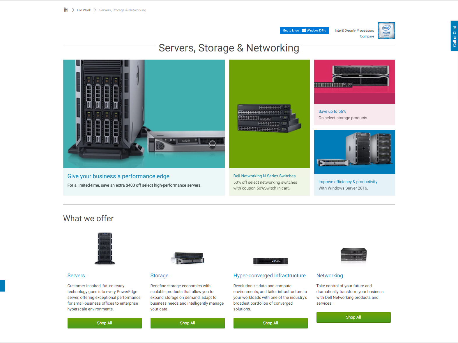
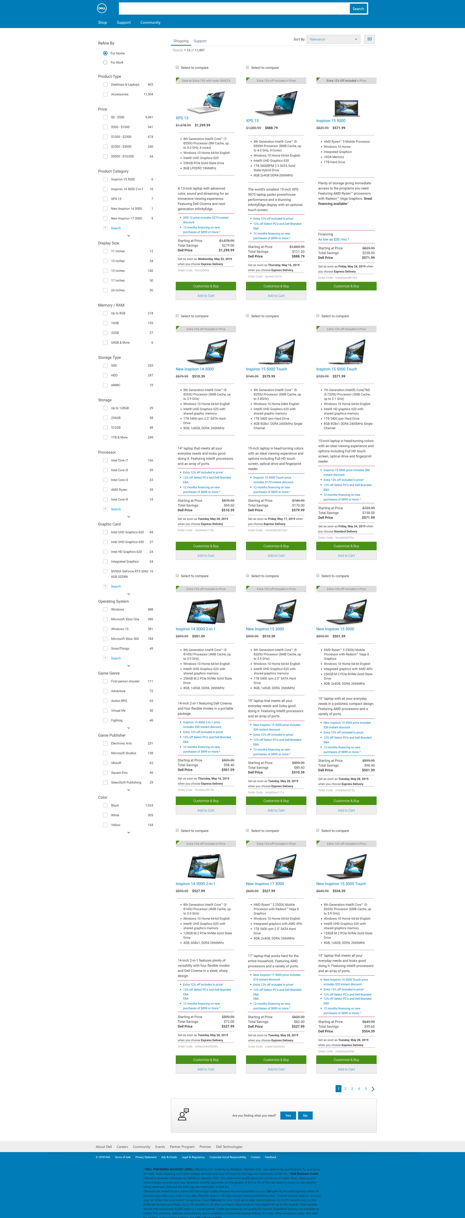
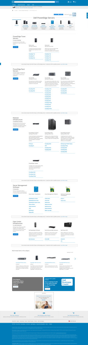
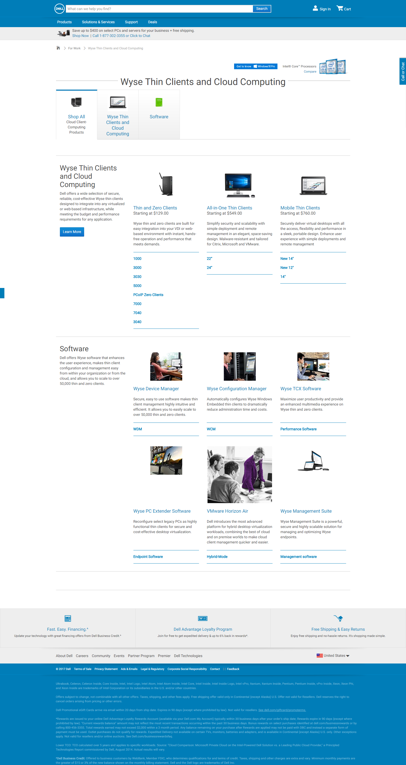
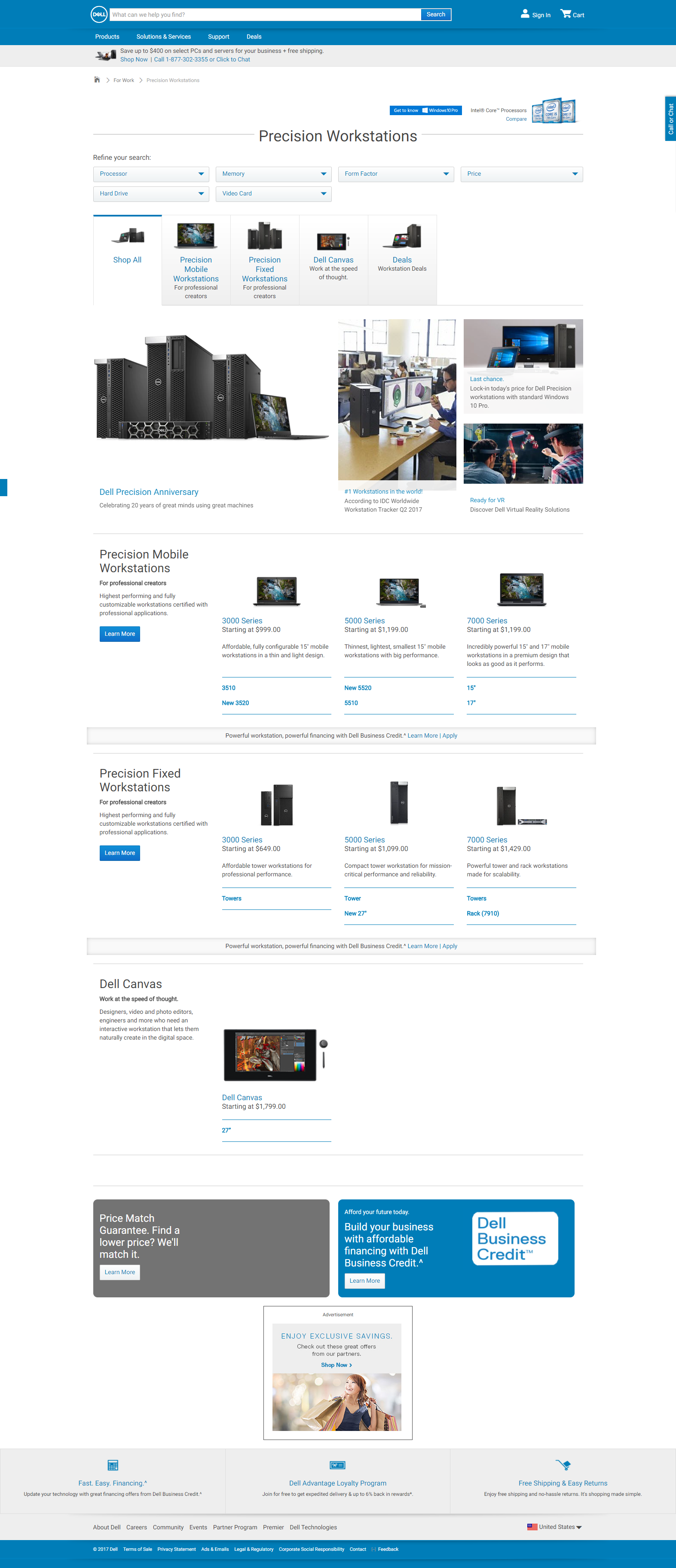
Servers Storage & Networking
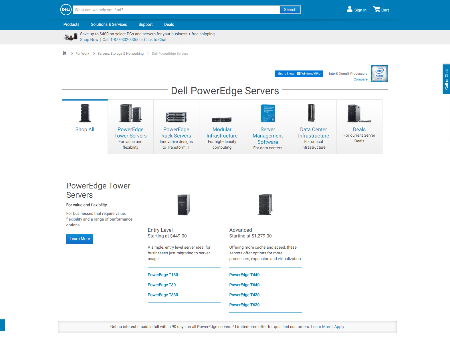
Researched and documented the Servers Storage and Networking funnel, and worked to redesign the funnel to be less confusing and more consistent between the various categories and sub-categories. Wired multiple design approaches to quickly compare various strategies and learn how components from other funnels could be used here.
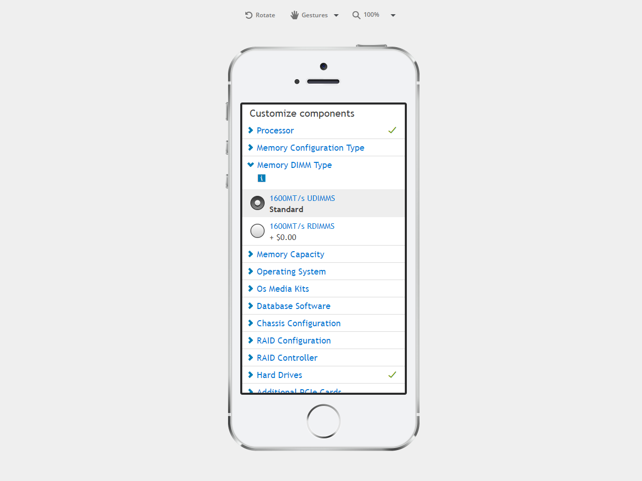
Configure Servers Mobile
Designed and prototyped a "what if" experience of configuring a complicated Dell Server on a mobile phone for in-depth usability testing. Used the JustInMind prototyping tool to allow for various selections and quantities of server components to be selected, as well as updating the total price accurately as selections were being made.